[ad_1]
Eight years ago, in 2016, Viren Joshi, president of Gujarat’s Service Association for the Blind, approached Ahmedabad-based architecture practice Sealab with a unique project. This was to visit Gandhinagar’s School for the Blind and Visually Impaired Children and help him improve its living conditions and education facilities for students.
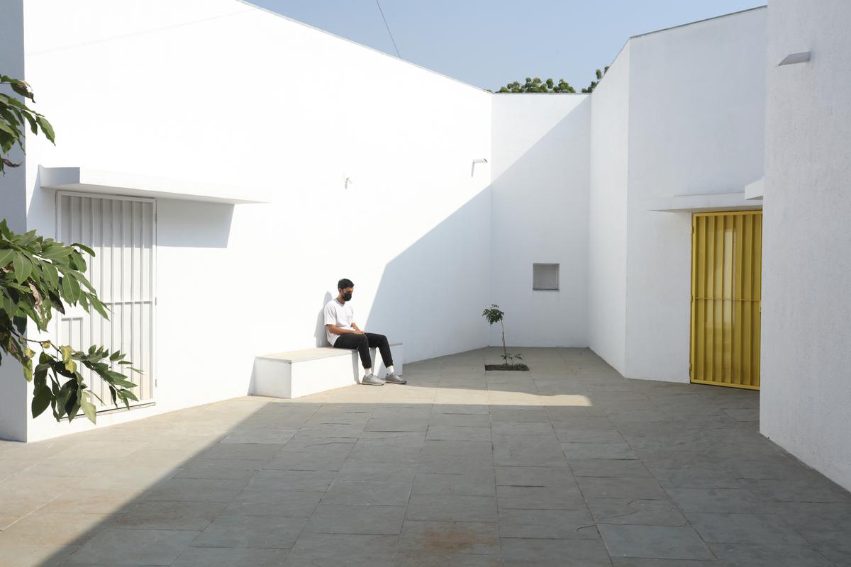
A snapshot of the school’s entrance.
| Photo Credit:
Dhrupad Shukla
Designed for children from remote villages and towns in Gujarat, the school was then functioning in a two-storey building where children lived on the ground floor and studied on the first floor. When the student numbers increased, the school was left overcrowded. Anand Sonecha, Principal Architect and founder, Sealab, says it was then “collectively decided to renovate the existing building and transform it entirely into the hostel block and a new academic building would be built which could accommodate 100 students. We were appointed as architects of the project in 2017 and the construction of the school was completed in 2021.”
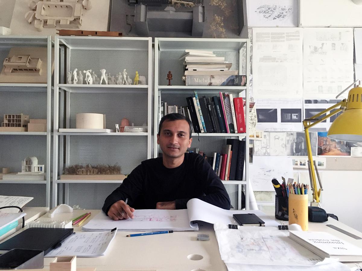
Anand Sonecha
Playing with light
And thus was born a school designed to be navigated with the help of more than one of the five primary senses. The new academic building, to the west of the existing one, has 10 classrooms with five different types arranged around a central courtyard. Each classroom around the central plaza has different features for specific uses — music rooms, meeting spaces, workshops, etc., and based on their functions, the classrooms have various forms, volumes, and light qualities.
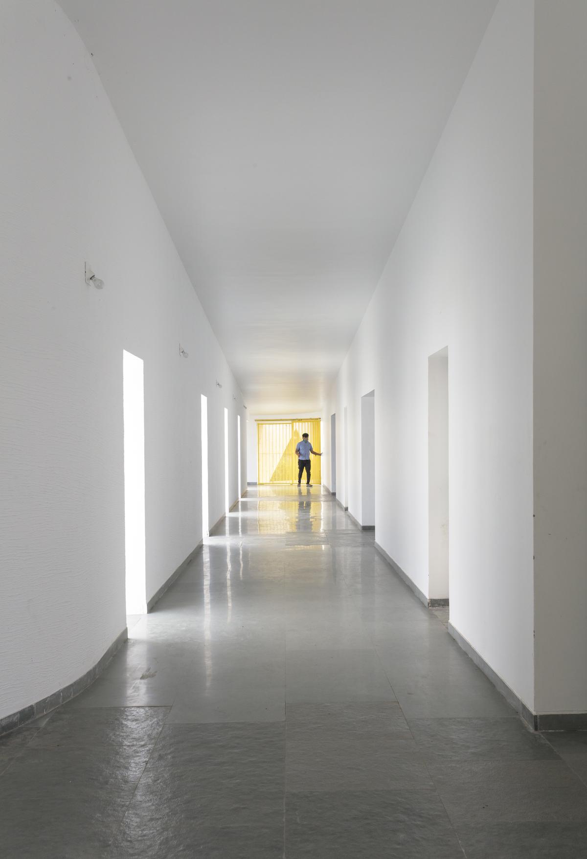
Specific skylights and openings have been designed to create contrasting areas with light and shade.
| Photo Credit:
Dhrupad Shukla
Sonecha explains that with many students having low vision, they can distinguish spaces that have the contrast of light and shadow or contrasting colours and surfaces. “Specific skylights and openings are designed to create contrasting areas with light and shade. For example, the entrance vestibule of the special classrooms is marked by a high ceiling with a skylight making a flare of light. Also, contrasting colours are used on the doors, furniture, and switchboards so that the students can easily differentiate the elements during navigation,” says the architect, adding that as students with low vision are sensitive to direct sunlight, the classroom has indirect, filtered light from the private courtyards and skylights.
To bank on their sense of hearing, the sound of voices or people walking changes according to the echo produced in the spaces. “The design attributes different heights and widths to areas of corridors and classrooms so that children can recognise them by sound. For example, the entrance corridor has a high ceiling height (3.66m), and it gradually reduces in height (2.26m) and width, giving an identifiable sound quality to each space.”
Flora species on campus
A few of the many plant and tree species include buch tree, borsalli, white champa, raat rani, mogra, kadam, parijaat, Sita ashok, jamun, chiko, mango, lemon, papaya, Singapori cherry, kachnar, peepal, rain tree, neem, lemongrass, among others.
Bringing in the green
Sealab collaborated with landscape architect Lokendra Balasaria who planted more than 1000 shrubs, plants, and trees of 37 species on campus, and also set up a traditional rainwater harvesting system. “The landscape has a significant role in the design,” says Sonecha, “Courtyards, located next to the classroom and connected to the corridor, have aromatic plants and trees, which help in the navigation of the building. The material and textures of the walls and floor, with smooth and rough surfaces, guide the students throughout the spaces.”
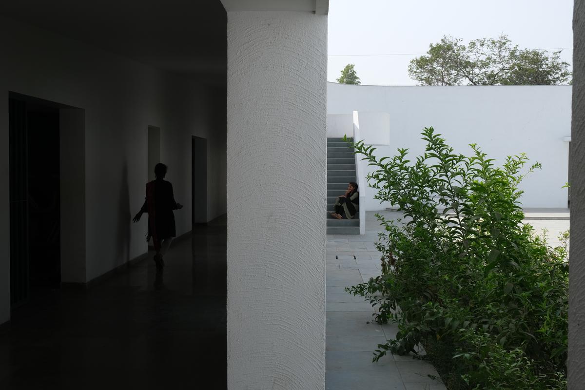
Courtyards, located next to the classroom and connected to the corridor, have aromatic plants and trees, which help in the navigation of the building.
| Photo Credit:
Anand Sonecha
For instance, there are five different wall plaster textures used in the building. The two longer sides of the corridor have horizontal textures, whereas the shorter side has vertical textures. “This helps students identify which sides of the corridor they are navigating. The central courtyard has a semi-circular texture, whereas the external surface of the overall building is sand faced plaster,” explains the architect currently working on Gram Setu, a community centre for farmers in Valuna village in Meghraj, Gujarat.
Visualising the design
Designing the project and keeping in mind intricate details aside, one of the challenging parts of bringing it all together was the design’s communication to the students, teachers, and trustees, many of whom are visually impaired. “Generally, architects use 2D drawings, models, and views to communicate the design with the users. Here, these tools became obsolete. There was a need to reinvent communication and participation tools,” says Sonecha, adding that the team initially relied on cardboard models to start a conversation with students and teachers. “They could visualise the built form through touch, but soon, we realised it wasn’t easy to comprehend the interior spaces and details.”
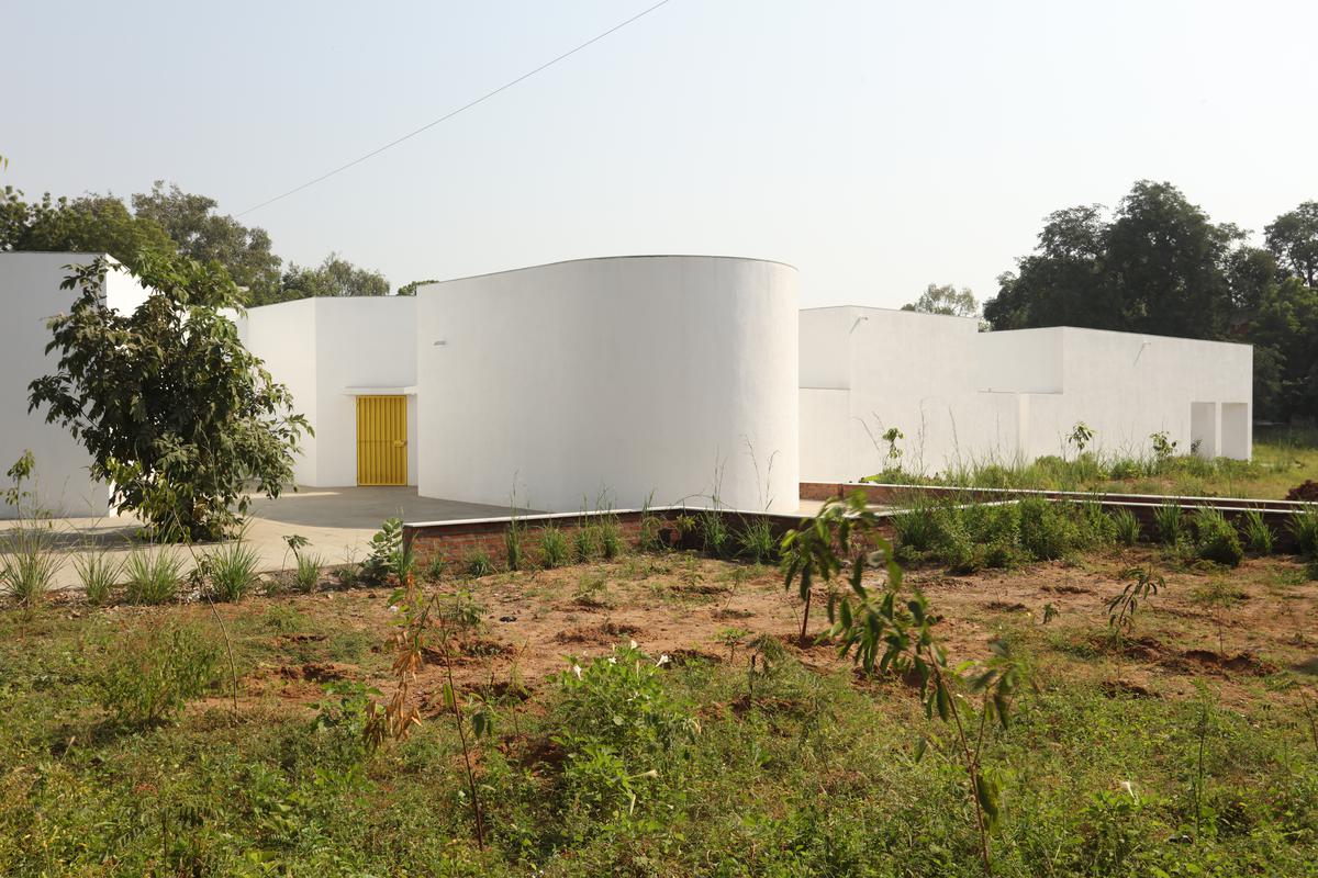
An external shot of the school.
| Photo Credit:
Dhrupad Shukla
To counter the issue, communication techniques using a 3D printer were developed to construct tactile drawings and robust models that the students could touch and visualise spaces. “We developed a code of textures to communicate the design to students and teachers. These textures overlapped the plan and helped them visualise the architectural spaces. The interior spaces had a different texture than the exterior, just like circulation spaces or classrooms. Moreover, each area (classroom, corridor, courtyard) was marked and written in Braille,” says Sonecha. In addition, 3D printed detailed models enabled students to get a feel of details like the furniture, and the spaces’ organisation and scale.
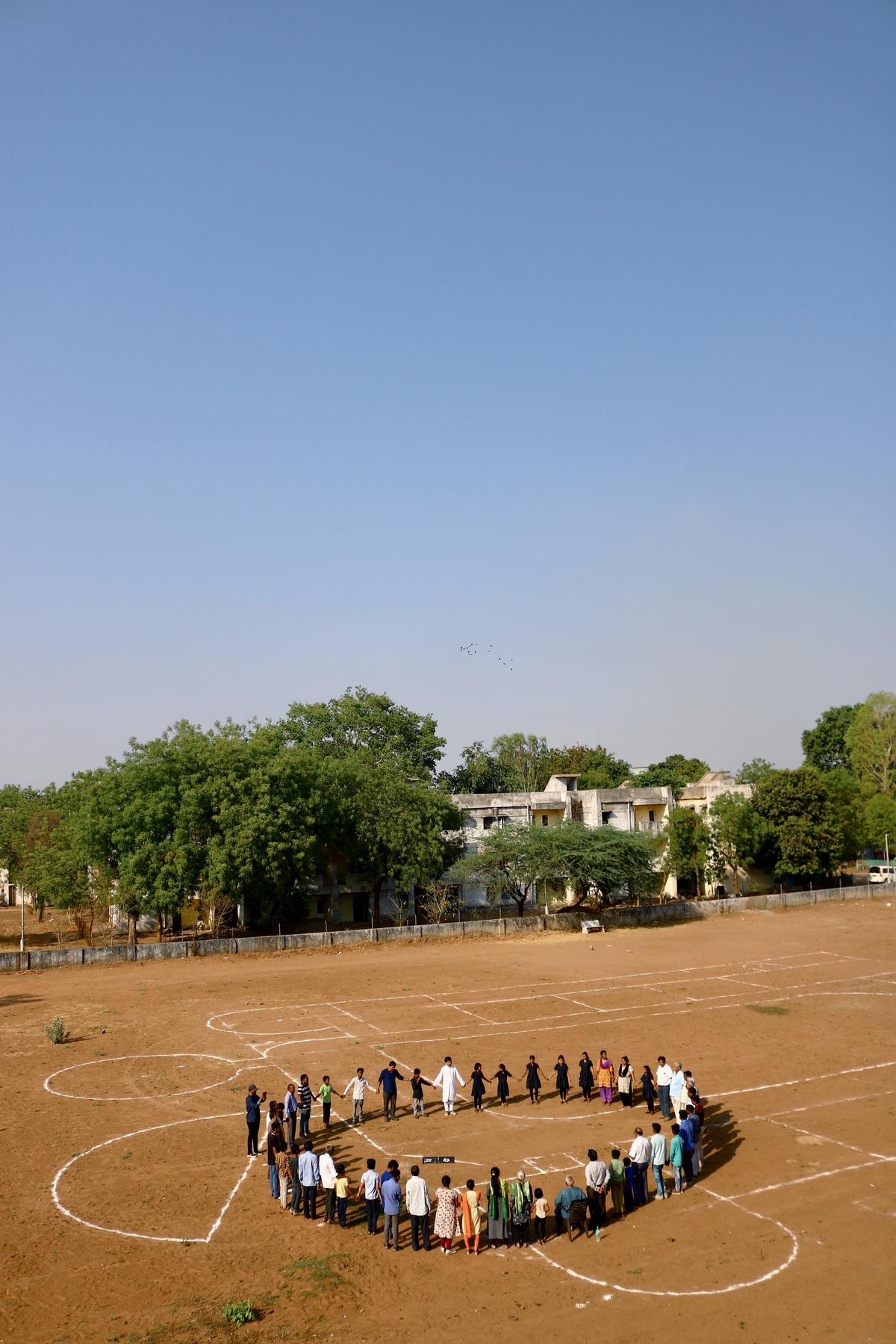
Before the construction, a full-scale line-up was done on-site for all trustees, professors, and some students.
| Photo Credit:
Aakash Dave
Updates underway
Before the construction, Sonecha says a full-scale line-up was done on-site. All trustees, professors, and some students circulated throughout the space and gave their feedback. “During the construction, the contractor built mock-ups of some techniques that could help the students navigate the building. For example, some of the students tried different wall plaster textures to clarify their effectiveness.”
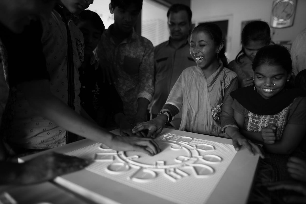
3D designs were developed to construct tactile drawings and robust models that the students could touch and visualise spaces.
| Photo Credit:
Dhrupad Shukla
Over the past two years, Sonecha says the post-occupancy survey is still underway. “We have made certain modifications to the connection from the hostel to the academic building for the ease and safety of the users. A few students gave feedback that in some classrooms the sound passes to another classroom via the intermediate courtyard. We are addressing it and we believe the thickening of vegetation will improve the condition,” he says, adding that several architecture students from across India and abroad have visited the school to conduct case studies as part of their academic programme. “Many students have been contacting us to know more about the design process of the school. This project is relatively unknown outside of the architecture community, and I hope we can share this project and our learnings with others who may need it,” says Sonecha.
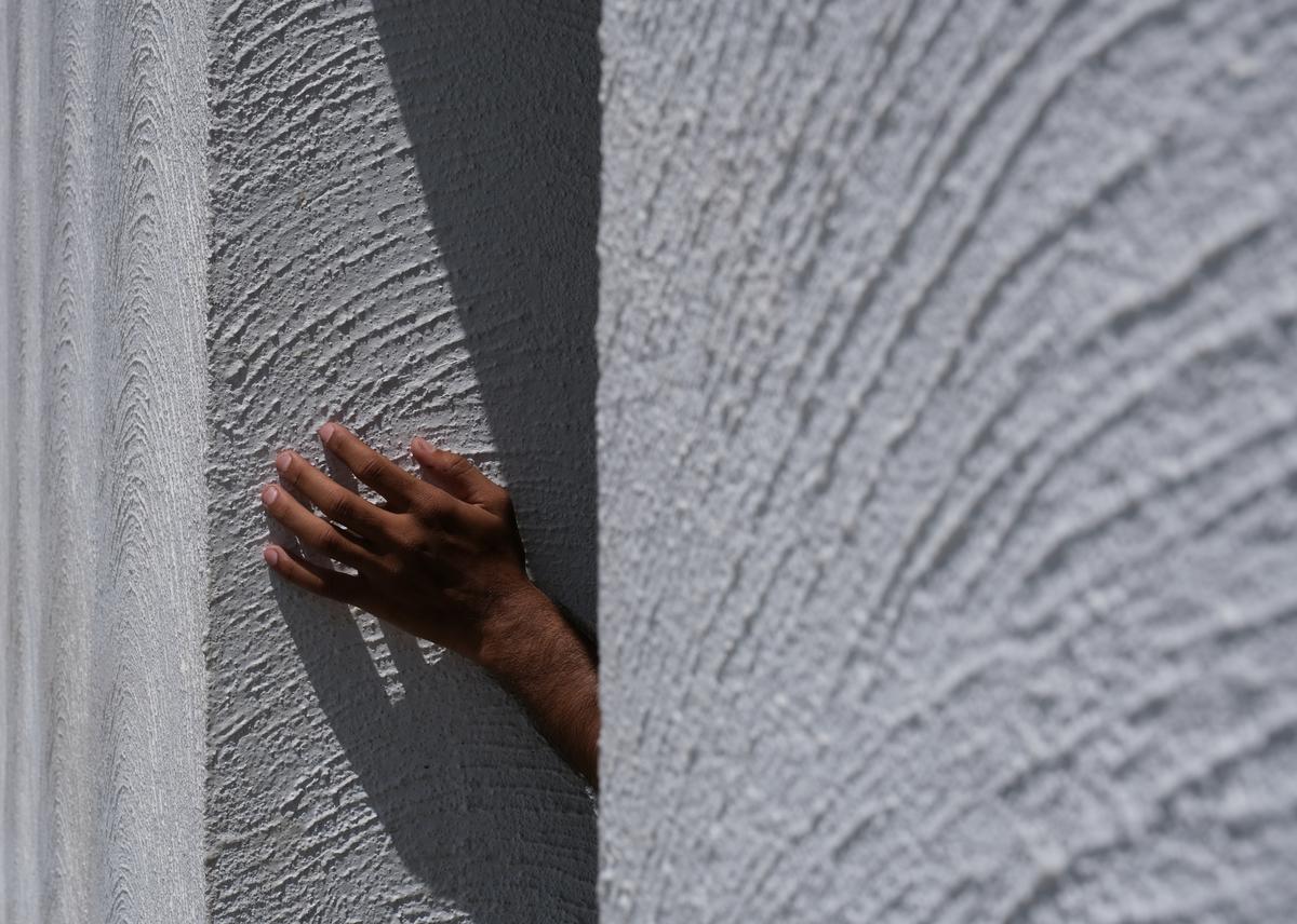
The material and textures of the walls and floor, with smooth and rough surfaces, guide the students throughout the spaces.
| Photo Credit:
Bhagat Odedara
While each of his projects have had their own challenges, this particular one was “special”. “We generally design buildings for users who depend on the visual ability to navigate and experience the place. In this school project the very sense that we use to understand the world i.e. sense of sight, became redundant. Therefore we relied on other senses for the users who perceive the world in another way,” says Sonecha, who goes on to talk about how, in architectural education or practice, he never delved into questions about such users to this extent. “It opened my eyes to the realisation that in designing any building, be it public buildings or entire cities, we must consider a diverse set of users, ensuring that no one is excluded. The lesson of inclusivity that I learned from this experience has influenced my approach to new projects,” concludes Sonecha.
[ad_2]
Source link


